

Intro
Apache ECharts is a powerful open-source charting library with tons of different chart types and an extensive library of online examples to help you get started. Last year we added support for ECharts in Appsmith, in addition to our native charting options. This guide will show how to copy one of those examples into Appsmith (Stacked Line Chart), and how to transform your data to the right format so you can connect it to the chart.
First we'll cover some basics on ECharts and how to use it in Appsmith. Next we'll use SQL functions to summarize the data and prepare it for the chart. Then we'll cover how to connect your data to the chart widget and create different series of data for each line on the chart. And lastly, we will show how make the query dynamic, allowing the user to select different columns to chart.
Using ECharts in Appsmith
First, head over to the ECharts examples page and find the chart that you're interested in. Click the chart to view its configuration. Most ECharts configs consist of only an option object, with all the other properties nested inside it. A few of them also include functions, and import other scripts and data. Those require a little more work to convert, but for this guide we're sticking to the easier ones.
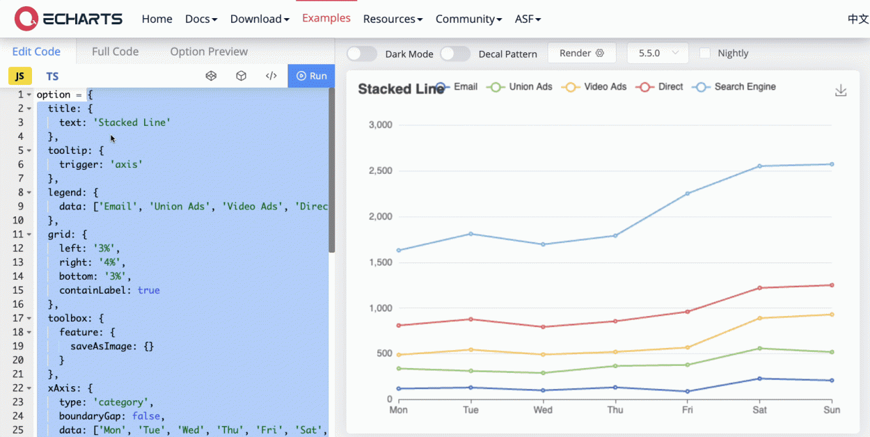
Copy just the option object itself, without the option = , or the trailing semi-colon. Now drag in a new Chart widget and set the chart type to Custom Echart. Then paste the option object into the Custom Echart Configuration property. Be sure to wrap the object in {{ }} mustache syntax. This will prevent errors due to the missing quotes around the property names, and also allows us to insert dynamic bindings later.
Simply pasting in the option object will get most EChart types to render. But to edit the option object and connect your data, you'll probably need more room to work than in that one input of the chart widget properties. So instead of pasting the option directly in the chart, create a new JSObject and store the option there. Then reference that object in the chart.

This will make it much easier to insert your data and edit the option object.
Getting your data in the right format
Next, consider your current data structure, and what you would like to chart. Chances are, your individual rows of data represent individual entities, like a single support ticket or customer account, per row. But for the chart you want aggregate values, like the total number of support tickets per day, or average account balance. Those values do not exist as a single row in the backend. In this case, you have two options:
- For SQL datasources, you can use aggregate functions like SUM(), AVG(), COUNT(), etc, and GROUP BY, to return the data already summarized by different groups. Use these functions to do most of the data transformation on the server, instead of in the browser with JavaScript. Some APIs also support SQL type queries by sending a query string, so use that if your API supports it.
- The other option is to transform the data and calculate the aggregate values using JavaScript. For this approach, you'll need the full dataset on the client side first. This only works for small datasets, and is not recommended unless option 1 is not available with your datasource.
Ok, that's enough theory, now on to a practical example. For this guide, I'm using a dataset of 2 million sales records, and creating a separate line series for each Item Type. We'll use the day of the week from the Order Date for the X-axis, and the sum of the Units Sold for the Y-axis. Here's the raw data format:
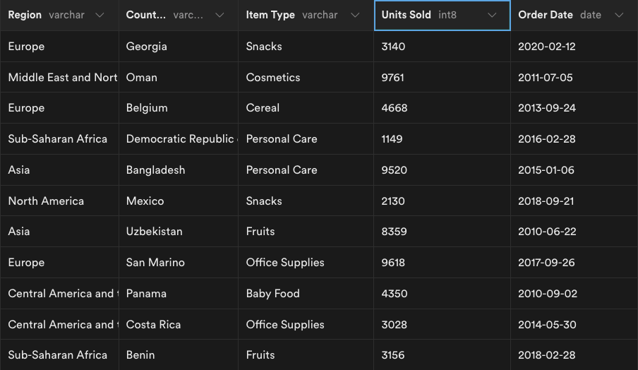
Let's look closer at each field we want to use in the chart.
Units Sold
This will be the aggregate column, using the SUM() function. When using an aggregate function, the other columns must be named in the GROUP BY clause.
Item Type
This will be the column we GROUP BY to create a new line series for each value. There are 12 Item Types in this dataset, so we'll have 12 lines on our graph.
Order Date
Here, we want to convert the date to a day of the week, then group by that value. Luckily, Postgres has this built in, with the EXTRACT() function and the DOW argument. This will reduce the full list of order dates over 10 years, down to 7 distinct values, giving us an overall combination of 84 datapoints.
Putting it all together
SELECT "Item Type", SUM("Units Sold") AS "Total Units", EXTRACT(DOW FROM "Order Date") AS "DOW"

FROM sales

GROUP BY "Item Type", "DOW"

ORDER BY "Item Type", "DOW"
A few things to note:
- Renamed
Units SoldtoTotal Unitsto avoid confusion with original field - Named the extracted day of week value to DOW
- The new names are used in the GROUP BY and ORDER BY, not the original column names
- ORDER BY is used to do the sorting on the server as well, instead of with JavaScript
Connecting your data to ECharts
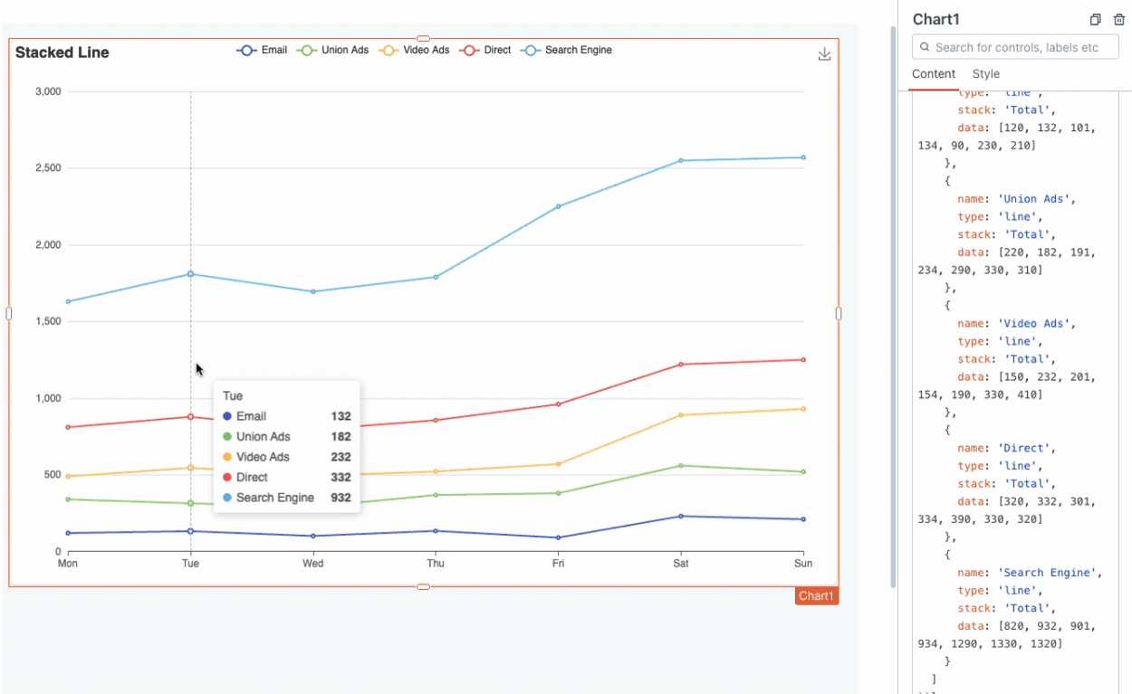
Now comes the fun part! Time to connect your live query data to the chart. First, take a closer look at the data being used in the option object from the ECharts example. Notice how the legend and xAxis have a fixed list of values, and the series contains the data for each point.
  legend: {
   data: ['Email', 'Union Ads', 'Video Ads', 'Direct', 'Search Engine']
 }, //...

 xAxis: {
    type: 'category',
    boundaryGap: false,
    data: ['Mon', 'Tue', 'Wed', 'Thu', 'Fri', 'Sat', 'Sun']
  },

  ...
  series: [
    {
      name: 'Email',
      type: 'line',
      stack: 'Total',
      data: [120, 132, 101, 134, 90, 230, 210]
    },...
This chart config object is supplying the data in a pre-formatted structure that's optimized for readability and minimum size. But your data is likely not in this format.
Rather than trying to extract arrays of numbers from your query for the series.data, you can pass in your dataset just as it's returned from the SQL query using the dataset.source property. See the docs for more info on adding a dataset source.
The stacked line chart example we're using does not contain a datasource property, but any chart can use it. This property lets you specify a datasource to reference elsewhere in the chart option, and also provides some extra functions for data transformations and filtering.
Start out by adding a dataset array inside the option object. Then add an object with a source property that references your query response.
option: {
      dataset: [
    {
      source: getSalesTotals.data
    }
    ],
    ...

    //rest of option object

    }
This dataset can then be referenced in the series data using datasetIndex: 0. But this is the full dataset, so it's not ready to pass to an individual series yet.
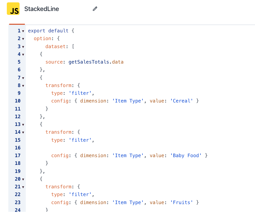
Now, you could filter the data with JavaScript to create the subsets of data for each line series, but ECharts will do it for you with the right config. You can actually filter and transform the data by just editing the JSON of the option object, rather than writing a function. Just add another object to the dataset array, with a transform property describing the new subset of data.
option: {
dataset: [
{
source: getSalesTotals.data
},
{
transform: {
type: 'filter',
config: { dimension: 'Item Type', value: 'Cereal' }
}
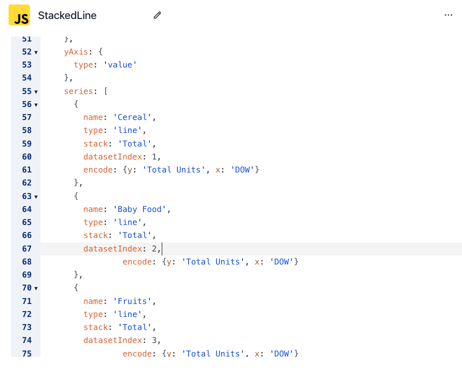
}This filtered dataset can be referenced as datasetIndex: 1, and supplied as one of the series.data.
series: [
     {
       name: 'Cereal',
       type: 'line',
       stack: 'Total',
       datasetIndex: 1,
                encode: {
                    y: 'Total Units',
                    x: 'DOW'
                }
     },
     {
       name: 'Baby Food',
       type: 'line',
       stack: 'Total',
       datasetIndex: 2,
                                encode: {
                    y: 'Total Units',
                    x: 'DOW'
                }
},Note: When using dataset.source to supply your data dynamically, you should also add the series[0].encode.x/y properties to tell the series which columns to use from your dataset.
To finish out the chart, just copy/paste the filter and update the filter condition for each Item Type, or whatever column you want to group by in your data.
Then do the same with the series, and make X number of copies to reference each datasetIndex from your filters.
This approach works great for charts where the columns being charted are fixed, but it has a few downsides.
- Each new series has to be hard coded and manually typed out in the config. There's no way to just tell it to look at the Item Type and see that there are 12 values, then create each series automatically.
- The axis are also fixed. You build the chart for one specific combo of xAxis + yAxis + series group.
This may be fine for your use case, but if you want to allow the user to choose which columns to chart, read on.
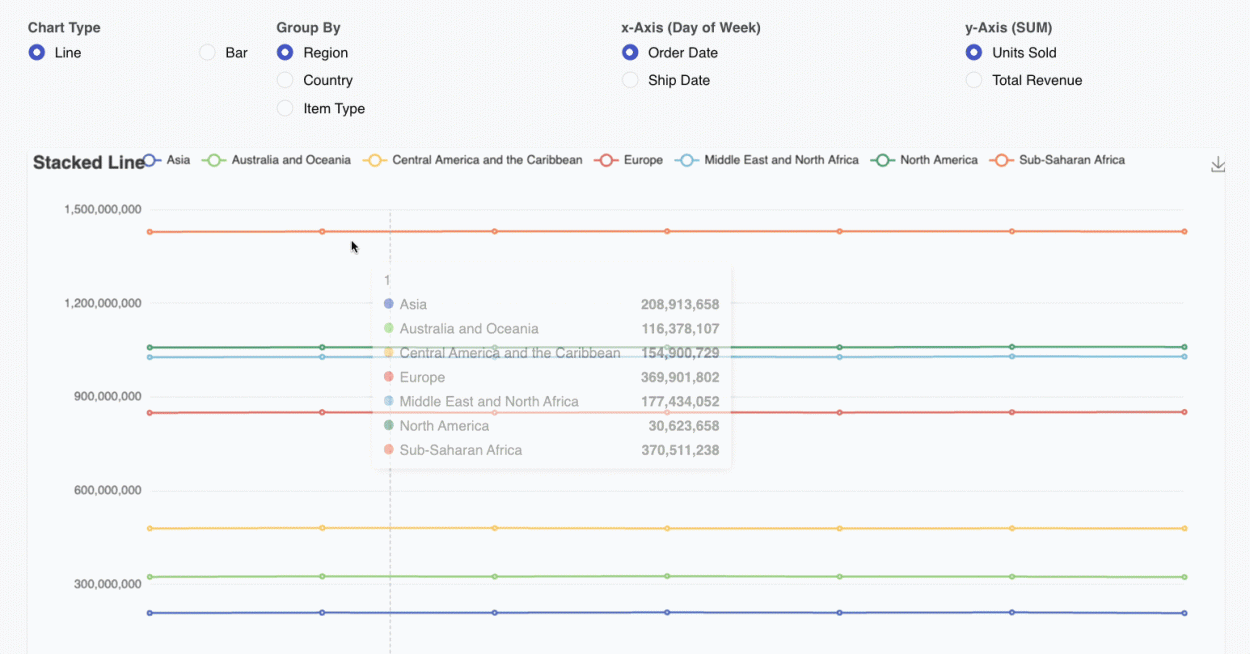
Adding dynamic charting by different columns
If you want to create similar charts using different columns from the data, you could copy the whole query + JS + chart, and change a couple of values to plot lines based on a different field. But that wouldn't be very DRY (don't repeat yourself). A better approach would be to let the user select the column names, and then pass those values to the SQL and JS functions to generate the chart dynamically.
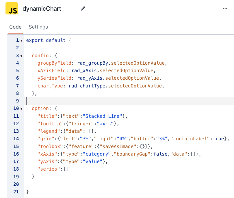
First, look at the option object for the chart and think about what parts should be a user input, or data from the SQL query. Replace the data arrays with an empty array placeholder. This will give us a place to push values to programmatically with a function in the next step.
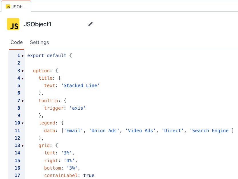
Here's the Stacked Line Chart's option object with all the arrays empty:
export default {
option: {
"title":{"text":"Stacked Line"},
"tooltip":{"trigger":"axis"},
"legend":{"data":[]},
"grid":{"left":"3%","right":"4%","bottom":"3%","containLabel":true},
"toolbox":{"feature":{"saveAsImage":{}}},
"xAxis":{"type":"category","boundaryGap":false,"data":[]},
"yAxis":{"type":"value"},
"series":[]
}
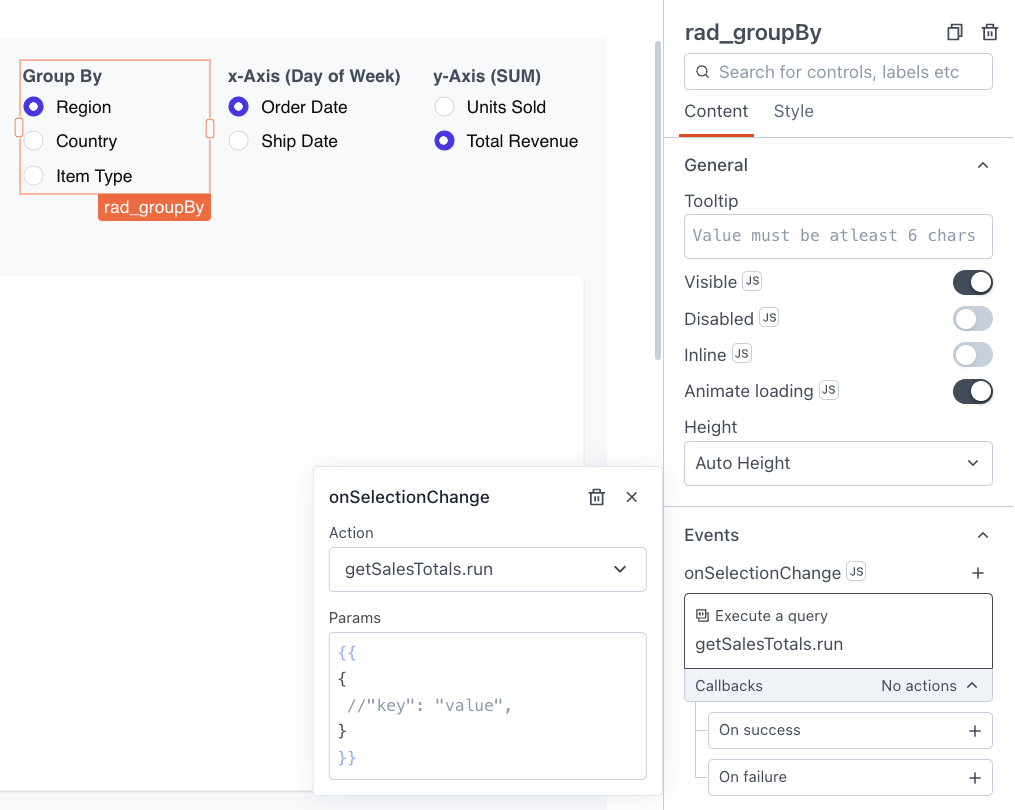
}Next, add a few Radio Group or Select Widgets so the user can choose which columns to Group By, and to use for the X and Y axis. Add the appropriate options for each one based on your data and the expected or allowed values. Keep in mind the Group By column should have a fixed list of values, and each one will create a new line or bar series.
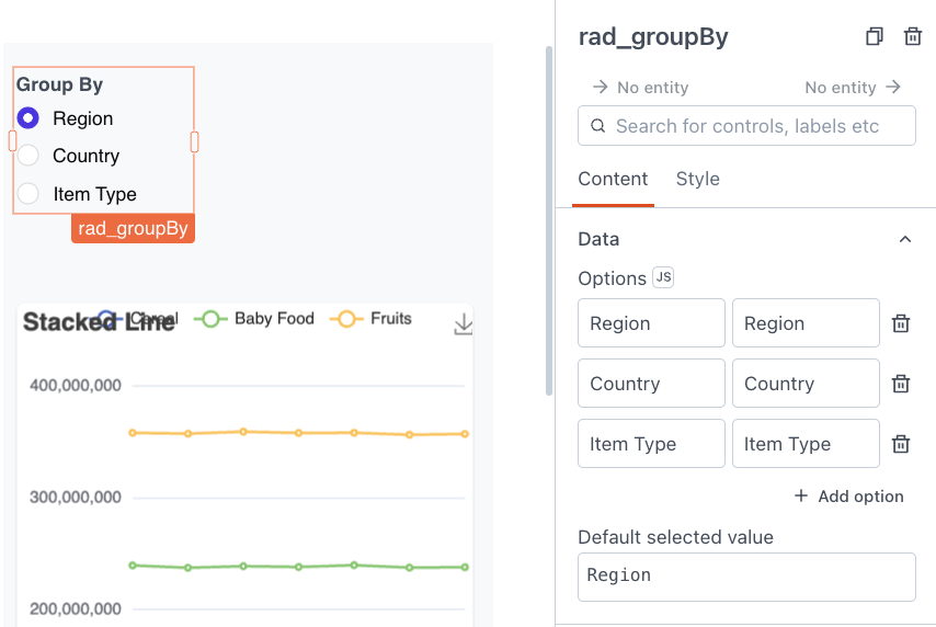
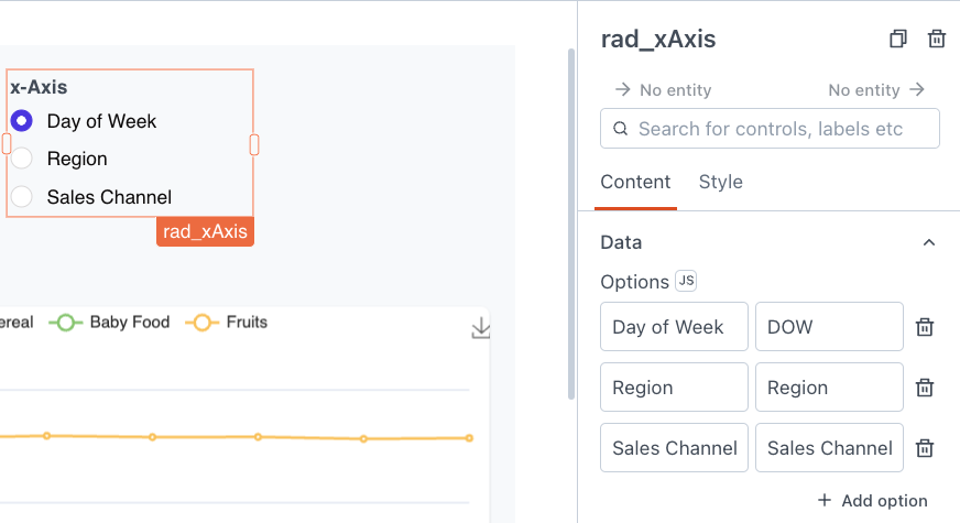
You can also add inputs to select the Chart Type, and any other chart options you want to make dynamic.
Connecting the Widgets to the SQL Query
Now go back to the SQL query, and replace each field name with a binding to the corresponding user input. Remember that the strings still have to be wrapped in quotes after the dynamic value is inserted. So each {{widgetName.selectedOptionValue}} binding should be inside double quotes. You'll also have to turn off prepared statements so that the dynamic bindings will work.

Now set each widget to rerun the query whenever the options are changed.
Generating the chart options dynamically
Next, add a new config object to the JSObject, and add a property for each widget.
Then add a buildChart() function with two parameters, the data from your query, and the config object.
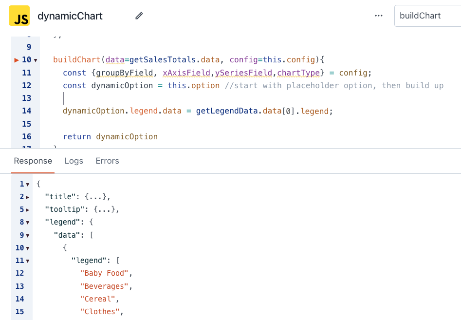
    buildChart(data=getSalesTotals.data, config=this.config){
        const {groupByField, xAxisField,ySeriesField,chartType} = config;
        const dynamicOption = this.option //start with placeholder option, then build up
        // function to genrate option object from data

        return dynamicOption
    }
The first line of the function destructures the config object to declare each variable. This way we can add more config settings later, without worrying about which param is 3rd, 4th, etc.
Next, we'll start with the easy part of the option object: the legend.data. This just needs a unique list of the values from the GROUP BY column, or the list of line series.
Add a new query to get the DISTINCT values from that field. You can save some more JavaScript work by requesting the data as an array using ARRAY_ARG(). Remember to turn off prepared statements for this one as well.
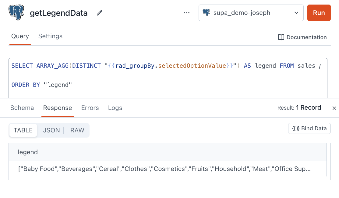
Set this query to run on page load. Then add a line to the function to update the option.legend.data.
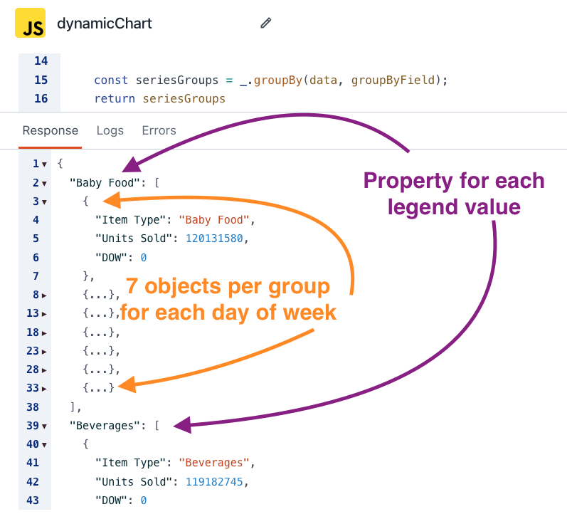
Now for the really fun part! We can loop over these values from the legend data to create a new series object and filtered set of data for each line series. Take a look at the structure of an individual series object. We can use this as a template, then loop over the legend values and create a new series from the template. Then just replace the series.data with the output, just like we did with the legend.data.
Next, use lodash groupBy to transform the flat SQL data to a nested object, with each filtered dataset in its own property.
const seriesGroups = _.groupBy(data, groupByField);

// return value
{
  "Baby Food": [
    {
      "Item Type": "Baby Food",
      "Units Sold": 120131580,
      "DOW": 0
    },
    {
      "Item Type": "Baby Food",
      "Units Sold": 118684832,
      "DOW": 1
    },
    {
      "Item Type": "Baby Food",
      "Units Sold": 119931820,
      "DOW": 2
    },...
    // Next GroupBy...
Ok, now for the REALLY REALLY fun part! Nested looping! First we'll loop over the top level properties of the new seriesGroup object, then run another loop inside each one to generate the series object for that line.
Start by defining a dynamicSeries variable as an empty array. Then loop over the legend data (list of groups or line series), and generate the series object for each line. Instead of an inner loop, you can use lodash _.map() to easily extract the values to use in the data property.
const dynamicSeries = [];
        const seriesNames = getLegendData.data[0].legend;
        seriesNames.forEach(seriesName => {
            const rawSeriesData = seriesGroups[seriesName];
            const formattedSeriesArray = _.map(rawSeriesData,ySeriesField);
            const thisSeries = {name: seriesName, type: chartType, stack: 'Total', data: formattedSeriesArray};
            dynamicSeries.push(thisSeries)
        })
Then just add this to the dynamicOption object, along with the yAxis values. Putting it all together, we have this:
export default {
    config: {
        groupByField: rad_groupBy.selectedOptionValue,
        xAxisField: "DOW", //rad_xAxis.selectedOptionValue,
        ySeriesField: rad_yAxis.selectedOptionValue,
        chartType: rad_chartType.selectedOptionValue,
    },
    buildChart(data=getSalesTotals.data, config=this.config){
        const {groupByField, xAxisField,ySeriesField,chartType} = config;
        const dynamicOption = this.option //start with placeholder option, then build up
        dynamicOption.legend.data = getLegendData.data[0].legend
        const seriesGroups = _.groupBy(data, groupByField);
        const dynamicSeries = [];
        const seriesNames = getLegendData.data[0].legend;
        seriesNames.forEach(seriesName => {
            const rawSeriesData = seriesGroups[seriesName];
            const formattedSeriesArray = _.map(rawSeriesData,ySeriesField);
            const thisSeries = {name: seriesName, type: chartType, stack: 'Total', data: formattedSeriesArray};
            dynamicSeries.push(thisSeries)
        })

        dynamicOption.series = dynamicSeries;
        dynamicOption.xAxis.data = _.uniq(_.map(getSalesTotals.data,xAxisField));
        return dynamicOption
    },
    option: {
        "title":{"text":"Stacked Line"},
        "tooltip":{"trigger":"axis"},
        "legend":{"data":[]},
        "grid":{"left":"3%","right":"4%","bottom":"3%","containLabel":true},
        "toolbox":{"feature":{"saveAsImage":{}}},
        "xAxis":{"type":"category","boundaryGap":false,"data":[]},
        "yAxis":{"type":"value"},
        "series":[]
    }
}Note: I'm ignoring the rad_xAxis.selectedOptionValue (line 4) since the extracted day of the week is always renamed to DOW in the SQL query. The input is still used to create a dynamic SQL query, but once the data is received, that column is always called DOW, so the JavaScript part doesn't need to be dynamic.

Conclusion
ECharts is an extremely powerful charting library on its own, and you can do a lot without writing any code. Add in a little JavaScript and SQL, and you've got yourself a dynamic chart generator, just like Tableau! Now anyone on your team can gain valuable data insights with just a few clicks!
This was a fun challenge, and it really tied together a lot of different skills and techniques. I hope you've enjoyed reading it as much as I did building this app!


The April Live Coding also covered Apache Echarts:
https://youtube.com/live/Jmq543Qnl0k