Natasha Andreeva  Verified user
Product Manager, UI building
Appsmith
One of the things that excites us about Appsmith is how easy it is to whip up a UI. You throw a few widgets into the mix, and you're off building a working app in no time. But let's be real, what happens when you need to add a field?
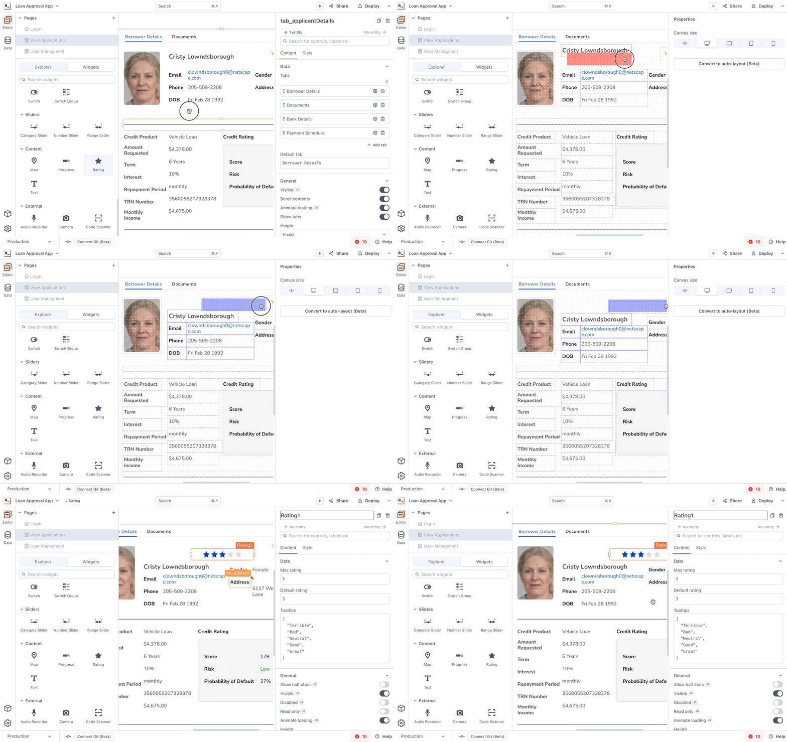
Inserting a new widget makes existing ones jump all over the place
Make sure your app stays on-brand?
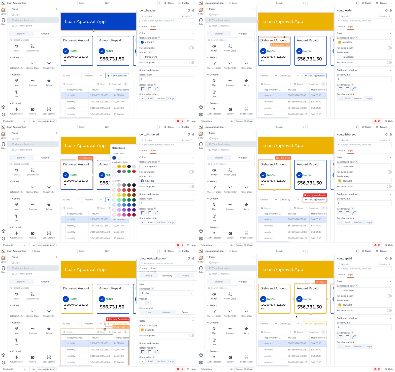
You'll have to change every colour on every widget in your app, figuring out the correct hues and colour pairs
Handle a complex app with tons of data that still needs to be used on any screen?
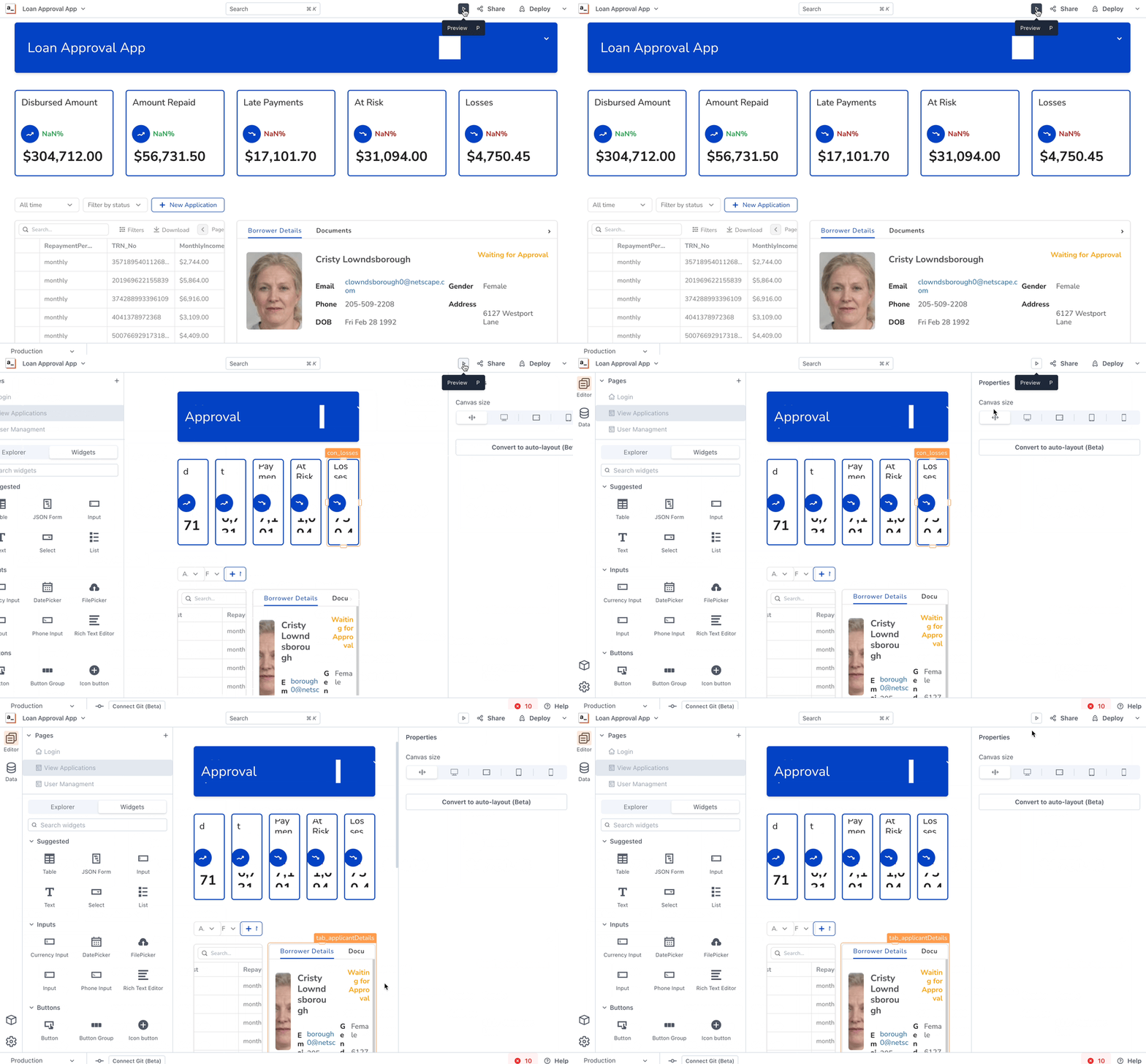
A reasonably complex app that looks fine on a desktop resolution will be scrambled and unusable on a smaller viewport
With these challenges in mind, we built and beta tested a solution that we called auto-layout last year. Now it’s time to reveal what is our next step in making UI building more efficient, intuitive, and robust than ever before.
Anvil isn't just a facelift; it's a whole new layout and widget system. We cherry-picked the best ideas from our existing UI builder and modern design software and went all out to support features and experiences that were just out of reach before.
We're just getting started, but we're itching to give you a sneak peek. In this post, we're dropping screencasts from our super early preview. Sure, there's a ton more development, polishing, and bug-fixing to do, but we couldn't wait to share.
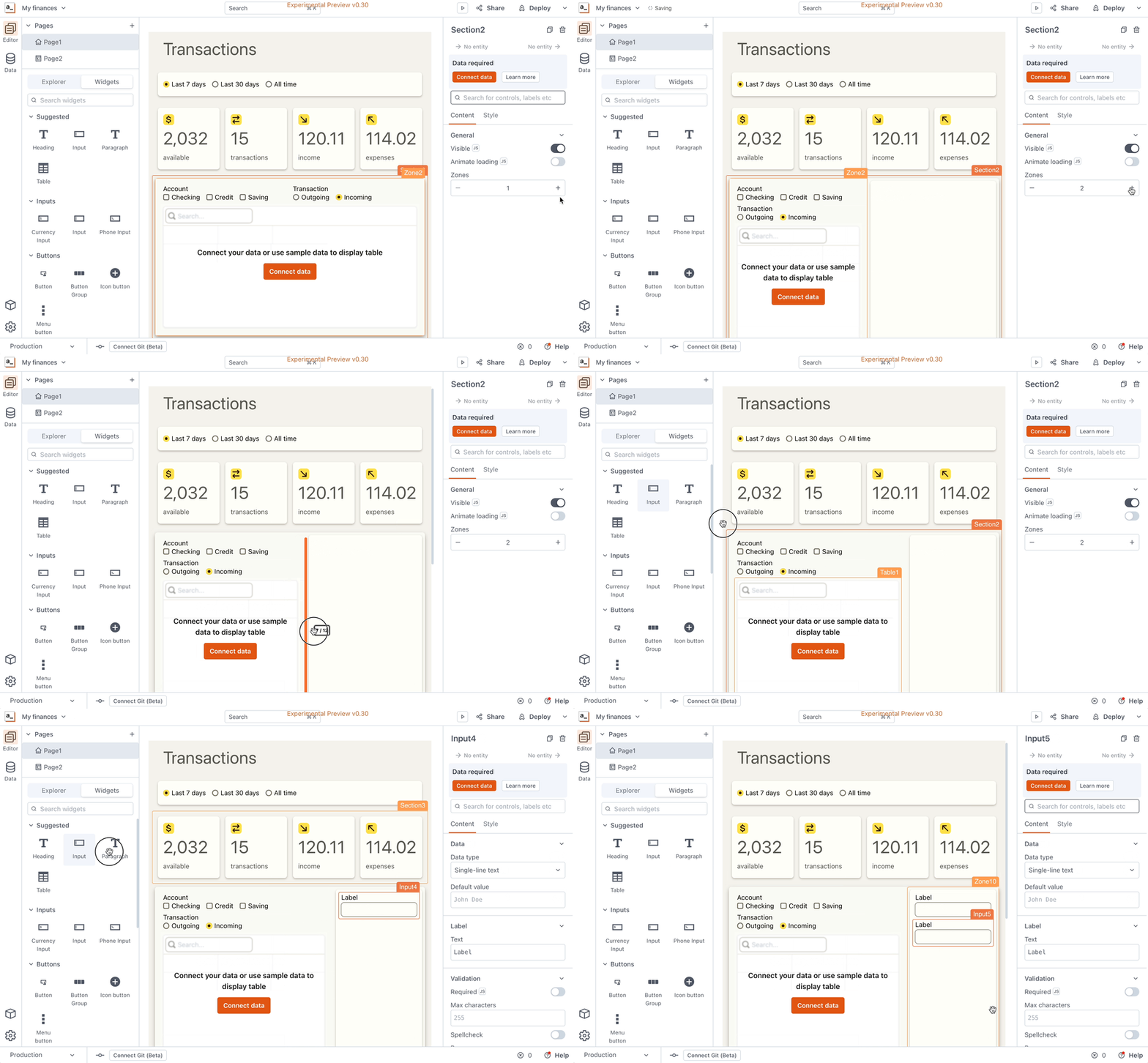
Iterate faster: organize your UI logically and rearrange it in one go
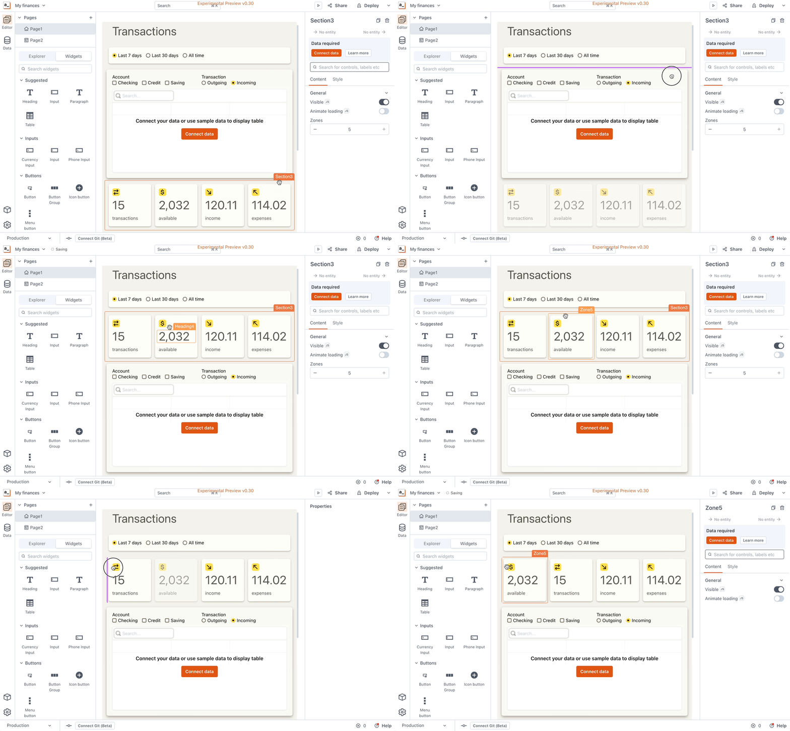
Create multicolumn layouts: a simple form, a master-detail layout, or a complex dashboard will be equally easy to bring to life
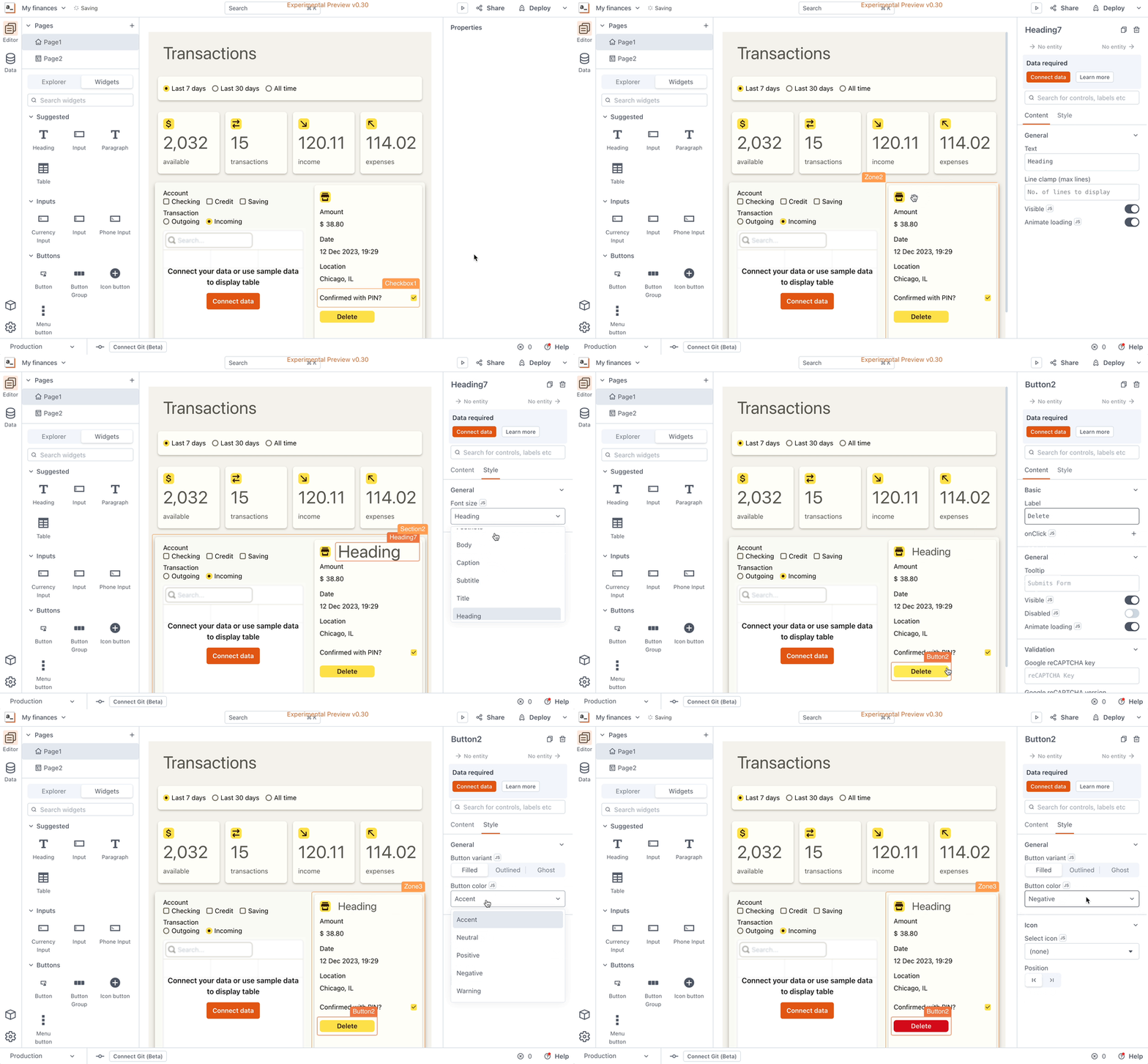
Keep your app tidy and consistent using semantic, globally managed styles
Change every colour of the app with just one click to match your company brand
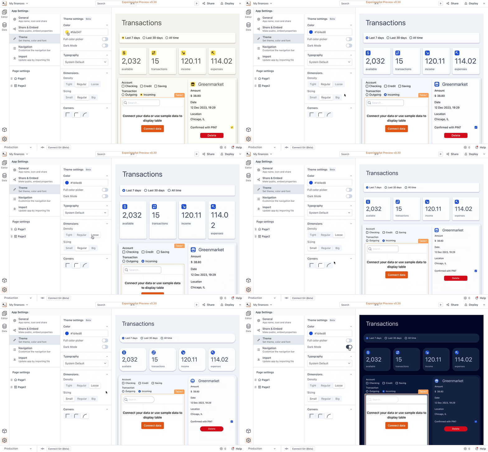
(And yes, Dark Mode is in the mix!)
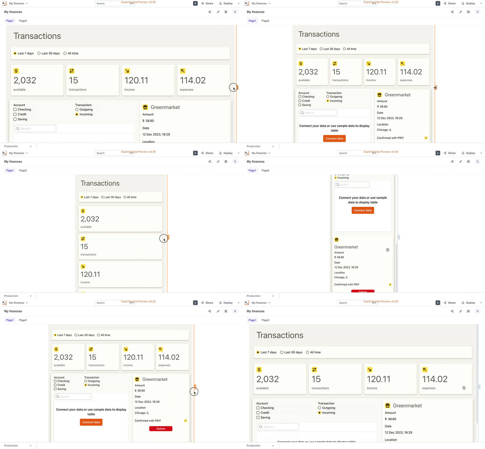
Responsiveness? Sit back and relax: Anvil will rearrange the UI blocks to fit into any viewport. Say goodbye to media queries and breakpoint headaches.
At Appsmith, we want you to spend time creating things that matter, not wrestling with UI. You need a tool that lets you iterate fast and get professional-looking results every step of the way.
But now we need to hear from you. What real-world scenarios should Anvil tackle? Sign up for the Anvil beta (coming soon!), jump into user testing, and have a direct line to our dev team. Your experiences will shape the future of UI building in Appsmith—because, honestly, we can't do it without you.
Can't wait to see this live!
Just tried out the demo. This is 🔥!
Hi, how are you?
What's the status of this feature?
I tried to sign up for the beta and it didn't allow me.
Thank you!
In reply to Hi, how are you? What's the… by ricardofernandez
Hey Ricardo,
thank you for your interest! Anvil is in development and we do accept beta testing sign ups. Could you please try signing up again using this link?
Hi, how are you?
When we are planning to release this feature?
Thank you!
In reply to Hi, how are you? When we are… by umeshdiwekar
This will most likely be out in the latter half of this year!
hi!what's the difference between auto-layout before?
In reply to hi!what's the difference… by dll
In the current version, the items will shrink on smaller screens, and if the container is set to "auto-height", then that will adjust as well. However, this sometimes doesn't scale well.
The NEW system (codename Anvil) is much "smarter" - it will also allow containers to flow and adapt to fit better. The results are much more impressive and produce more reliable results across all device sizes.
Hello, any news for the launch of this feature?
In reply to Hello, any news for the… by rodrigotorres
We are in alpha testing and we haven't announced a launch date yet
Awesome! :)
Great improvement. Can you tell us an approximate release date?
This feature is amazing! Looking forward to the release, is it coming out in 2025?