Issue
As a developer, I want to create a generic modal that can be initialized with text and allow me to respond to boolean result in different calling methods for confirmations, errors, and infos. I need to use JS async-await and storeValue functions to achieve this.
Resolution
In this article, you’ll learn how to build a generic, reusable modal (dialog) component in Appsmith that can be initialized with custom text and return a boolean result (approved or rejected) to any calling context. The modal will be packaged as a module so it can be easily reused across your applications.
Why this pattern?
Rather than building a new dialog from scratch in each use-case, a reusable module allows you to:
- Standardize look & feel and user experience
- Encapsulate logic (opening/closing, returning result)
- Simplify calling code by passing configuration and receiving a single boolean response
- Promote reuse across multiple pages or apps
Prerequisites
- Familiarity with Modals in Appsmith (see the Modal widget reference)
- Understanding of JS Objects in Appsmith and how to invoke functions from them
- A UI Package (optional) if you want to publish this as a reusable module across apps
Step-by-Step Implementation
1. Create the Modal widget inside a UI package
- In your Appsmith workspace, create a UI Package to house this component.
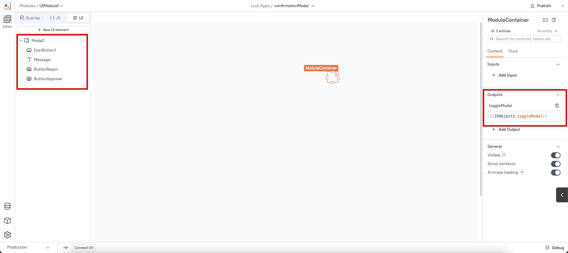
- Within the container drop a Modal widget.
- Add widgets inside the modal such as:
- A Text widget for the dynamic message.
- Two Buttons: "Yes" and "No".
- Add an Output property called "toggleModal" to the UI package module container.
- Map the modal’s toggleModal function to the Output binding.
2. Create a JS Object inside the module for logic
Inside the same UI package:
export default {
	functions: {},
	onApproveWrapper: () => {
		let onApprove = this.functions["onApprove"];
		onApprove();
	},
	onRejectWrapper: () => {
		let onReject = this.functions["onReject"];
		onReject();
	},
	toggleModal (modalState, options) {
		if (!!modalState) {
			Message.setText(options.message || "");
			this.functions["onApprove"] = options.onApprove;
			this.functions["onReject"] = options.onReject;
			showModal(Modal1.name);
		} else {
			closeModal(Modal1.name);
		}
	}
}
3. Map the approve/reject wrapper functions to the modal buttons
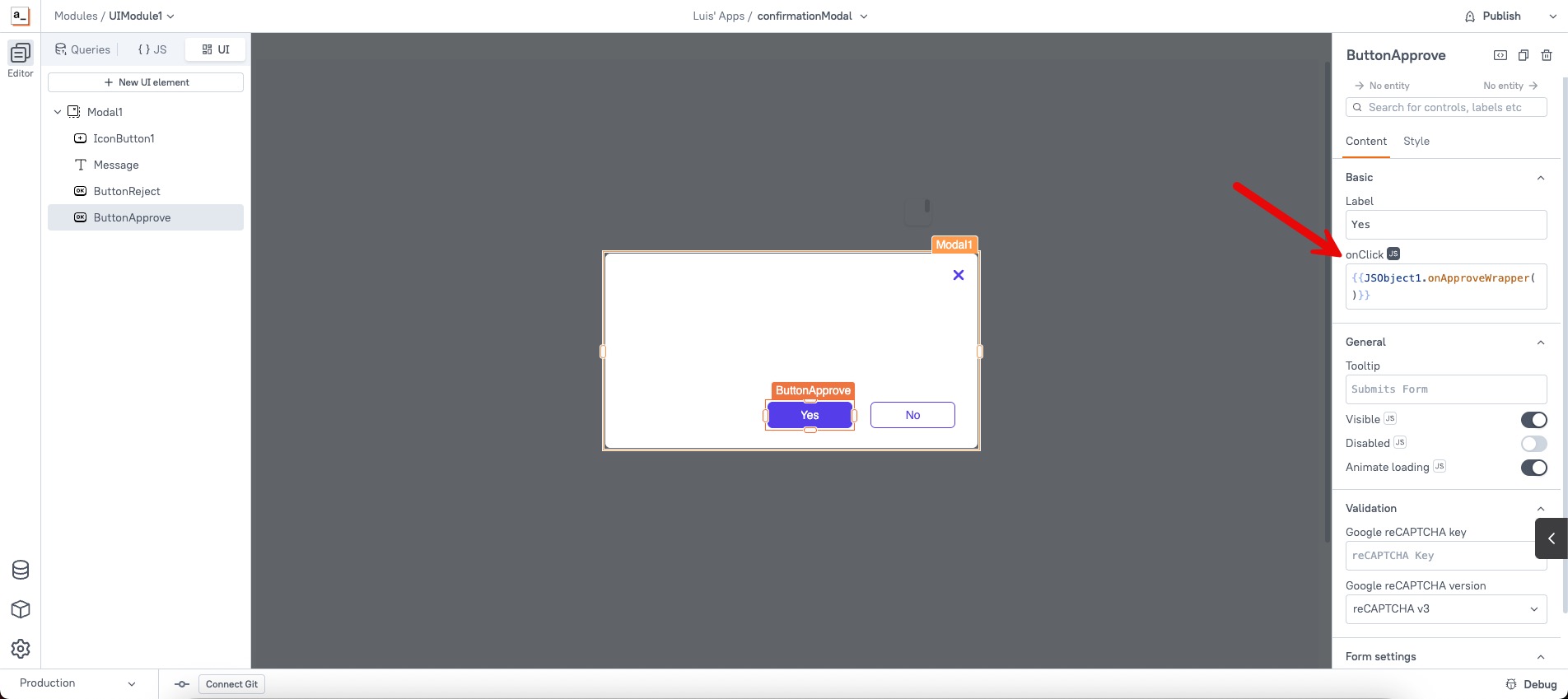
- For the "Approve" button inside the modal, set the onClick to call
JSObject1.onApproveWrapper(). - For the "Reject" button, set onClick to
JSObject1.onRejectWrapper(). - Ensure that the button actions close the modal and resolve the Promise so the calling code knows the outcome.
4. Publish the module (optional)
- If you want to reuse this across multiple apps/pages, publish it as a UI Module within a UI Package.
- Once published, install/import this module in your target application.
5. Use the modal in your application
In the application where you want to use the reusable modal:
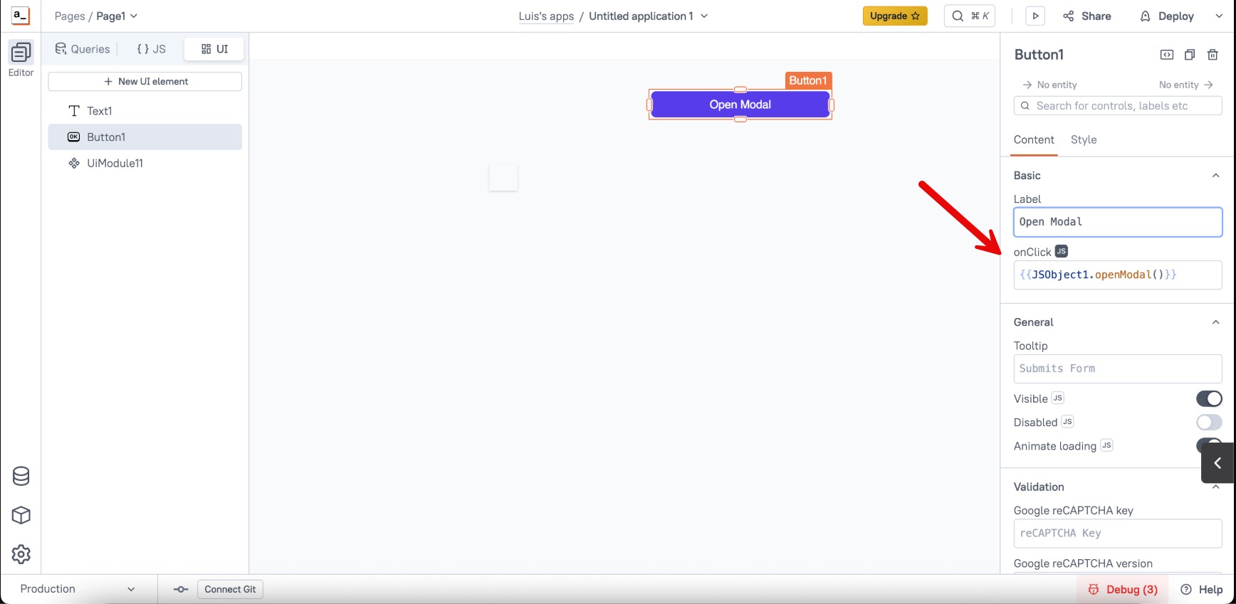
- Create a new JSObject with a function like:
export default {
  openModal() {
    UiModule11.outputs.toggleModal(true, {
      message: "Testing",
      onApprove: () => showAlert("Approved modal", "success"),
      onReject: () => showAlert("Reject modal", "error")
    })
  }
}- Call the function wherever you need it (e.g.; a Button widget):
By following this approach you create a clean, reusable modal component in Appsmith that your developers can easily call. This abstraction helps reduce duplicated UI logic, centralizes styling and behavior, and simplifies your codebase.