


How to Integrate Bryntum Into Appsmith - Getting Started Guide
Goal
At the end of this tutorial, you'll have learned how to integrate Bryntum's powerful web components (Grid, Gantt, Scheduler, Calendar, and Kanban) into your Appsmith applications using the Custom Widget feature and the fundamentals of setting up a basic Bryntum Grid component within Appsmith's environment. You can see the final result we'll build together here: https://internal.appsmith.com/app/bryntum-appsmith/grouped-headers-6865a9df30dfd63f8b482375
Prerequisites
A Bryntum Free Trial License (Get it here and download the JS library)
A Free Appsmith Account or Running Instance
Overview
Bryntum is a comprehensive suite of premium web components designed for modern data visualization and project management needs. Their library includes highly customizable Gantt charts, Schedulers, Data Grids, Calendars, and Kanban boards that seamlessly integrate with popular frameworks including React, Vue, Angular, and vanilla JavaScript applications.
What sets Bryntum apart is its focus on performance and feature richness - their components are built to handle large datasets while providing extensive customization options, making them ideal for enterprise-level applications that require sophisticated data presentation and user interaction capabilities.
While Appsmith provides a powerful low-code platform with a robust set of built-in widgets, there are scenarios where you need more specialized or advanced UI components. Bryntum's components excel in areas where standard widgets might fall short:
- Complex Project Management: Bryntum's Gantt charts offer advanced project timeline visualization with dependencies, critical path analysis, and resource management
- Advanced Scheduling: Their Scheduler component provides sophisticated calendar and timeline views with drag-and-drop functionality
- High-Performance Data Grids: Handle large datasets with virtual scrolling, advanced filtering, and real-time updates
- Interactive Kanban Boards: Create dynamic workflow management interfaces with customizable swim lanes and card layouts
By integrating Bryntum with Appsmith through Custom Widgets, you can leverage the best of both worlds: Appsmith's rapid application development capabilities and 30+ native datasource integrations combined with Bryntum's specialized, enterprise-grade UI components.
Basic Integration
As mentioned in the prerequisites, you'll need a free trial of the Bryntum JS library. Once you've created your free trial account and downloaded the JS library package, you'll need to host it somewhere accessible to Appsmith, such as an S3 bucket, GCP Storage bucket, your own CDN, or on the same server where Appsmith is running. Ultimately, all you need is an accessible URL to import the JS library into Appsmith.
We'll use the UMD build library for this integration. Once you get the free trial and host it yourself it should look like this URL:
https://{YOUR_HOST_DOMAIN}/grid/build/grid.umd.js⚠️ Warning: If you are hosting a licensed Bryntum component (e.g. Grid) online, ensure it is private and accessible only to you.
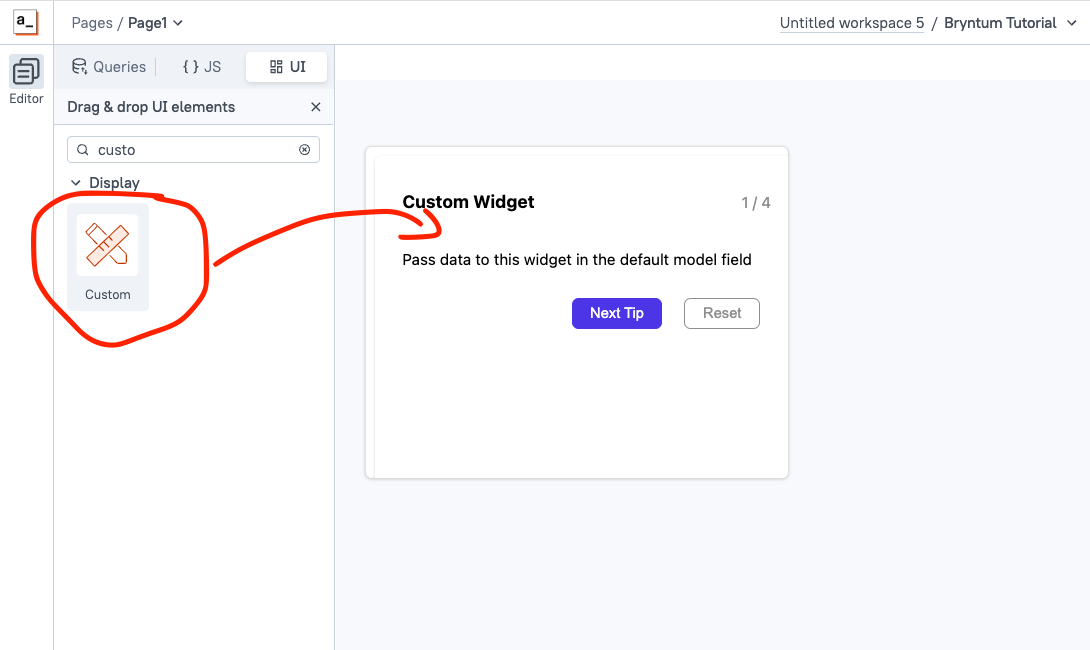
With the library hosted and accessible, let's jump into your Appsmith app. Navigate to the UI tab in the widget panel, find the Custom Widget, and drag and drop it onto your canvas.
Now, select the newly created Custom Widget in the canvas and you'll see the Edit Source button on the right side (Custom Widget Properties)
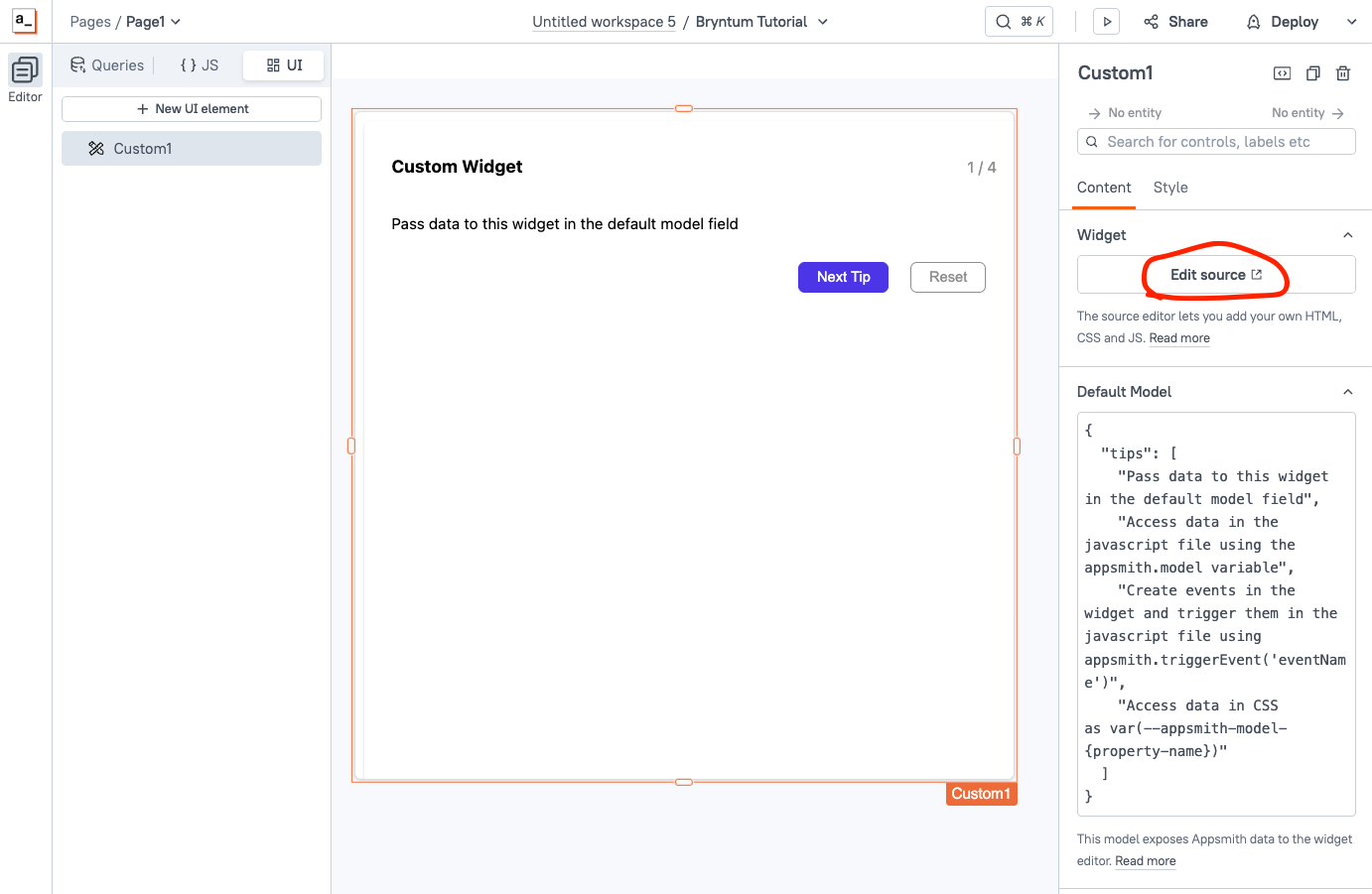
When you click this button, it will take you to the Custom Widget code editor, where you'll be able to write your own code (HTML structure, CSS styles and JS logic) and as well you can import your desired JS library. By default Appsmith will provide a sample Custom Widgets which is a simple tips carousel, we'll edit each tab separately.
Let's start with the HTML structure. In the HTML tab of your Custom Widget, let's add the following code:
<link rel="stylesheet" href="https://cdnjs.cloudflare.com/ajax/libs/font-awesome/6.7.2/css/all.min.css" integrity="sha512-Evv84Mr4kqVGRNSgIGL/F/aIDqQb7xQ2vcrdIwxfjThSH8CSR7PBEakCr51Ck+w+/U6swU2Im1vVX0SVk9ABhg==" crossorigin="anonymous" referrerpolicy="no-referrer" />
<link rel="stylesheet" href="https://YOUR_SERVER/build/grid.stockholm.css">
<script src="https://YOUR_SERVER/build/grid.umd.js"></script>

<div id="app">

</div>
With this code, we are importing Font Awesome (the icon library), the Bryntum CSS file, and the Bryntum JS UMD library. Then we add a simple
<div>that will contain the app, which we'll populate with JavaScript in the next step.Understanding Appsmith Custom Widget Methods
Before we dive into the JS code, let's quickly cover the essential Appsmith Custom Widget methods we'll be using:
appsmith.onReady()- Ensures the parent application is fully initialized before your component starts rendering. Always initialize your custom components within this handler.appsmith.model- Accesses data passed from the Default Model property, allowing you to retrieve configuration and data from other Appsmith widgets.appsmith.updateModel()- Updates the widget's model properties, enabling real-time data synchronization between your custom widget and the parent application.appsmith.triggerEvent()- Executes custom events you've defined in the widget's property pane, perfect for handling user interactions like clicks or form submissions.
Now let's implement the JavaScript functionality for our Bryntum Grid integration knowing what these methods are. In the JS tab of the Custom Widget, let's add the basic structure we should have:
function initApp() {

	const { Grid, DataGenerator } = bryntum.grid;

	const grid = new Grid({
       appendTo : app,
       features: { },
       columns : [ ],
       data : [ ]
   });
}
appsmith.onReady(() => {
	initApp();
});
Our first function is responsible for initializing the app. The first step is referencing the HTML "app" element where the Bryntum Grid will be injected. Then, we create a new instance of a Bryntum constructor, passing the following parameters:
- appendTo: HTML element
- features: An object with the features that the Grid will have (see Docs for the list of features)
- columns: An array of the Grid columns
- data: An array of data to inject into the columns
Lastly, in the
appsmith.onReady()method, we call our initializer function, and that's it! Now, let's add real data to it so we can see the final result.Add the JS Code
Now that we understand the Custom Widget structure, let's add real data to the columns and data properties so we can see our Bryntum Grid. Add the following code in the JS tab:
function initApp() {

	const { Grid, DataGenerator } = bryntum.grid;

	const grid = new Grid({
    appendTo : app,
		features : {
        	columnPicker : true,
        	regionResize : true,
        	headerMenu   : {
            	moveColumns : true
        	}
    	},
    	columns : [
        	{ text : 'Customer #', field : 'id', width : 100, locked : true, editor : false },
        	{
            	id           : 'contact',
            	text         : 'Contact',
            	collapsible  : true,
            	collapsed    : true,
            	collapseMode : 'toggleAll',
            	children : [
                	{ text : 'First name', field : 'firstName', width : 150 },
                	{ text : 'Surname', field : 'surName', width : 150 },
                	{ text : 'Name', width : 150, renderer : ({ record }) => `${record.firstName} ${record.surName}`, hidden : true }
            	]
        	},
        	{
            	text        : 'Favorites',
            	id          : 'fav',
            	collapsible : true,
            	children    : [
                	{ text : 'Food', field : 'food', width : 100 },
                	{ text : 'City', field : 'city', width : 150 },
                	{
                    	type     : 'template',
                    	text     : 'Color',
                    	field    : 'color',
                    	width    : 200,
                    	template : ({ value }) => `<div class="color-box" style="background-color:${value}"></div>${value}`
                	}
            	]
        	},
        	{
            	id       : 'other',
            	text     : 'Other info (not collapsible)',
            	children : [
                	{ text : 'Rating', field : 'rating', width : 100 },
                	{ type : 'date', text : 'Time', format : 'HH:mm', field : 'time', width : 150 },
                	{ type : 'percent', text : 'Percent done', field : 'percent', width : 150 },
                	{ text : 'Age', field : 'age', width : 150 }
            	]
        	},
        	{
            	text     : 'A link',
            	type     : 'template',
            	editor   : false,
            	width    : 200,
            	template : () => `<a href="https://bryntum.com" target="_blank">Click me</a>`
        	},
        	{ text : 'Done', type : 'check', field : 'done' },
        	{ text : 'Notes', field : 'notes' }
    	],
    	data : bryntum.grid.DataGenerator.generateData(50)
});

}
appsmith.onReady(() => {
	initApp();
});
As you can see, in this grid we are adding
headerMenuandcolumnPickerfeatures, then we are adding the columns (with collapsible columns), and we are usingbryntum.grid.DataGenerator.generateData(50)to generate sample data easily—very handy!Lastly, let's add some CSS
#app {
	height: calc(var(--appsmith-ui-height) * 1px);
	width: calc(var(--appsmith-ui-width) * 1px);
	justify-content: center;
	padding: 29px 25px;
	font-family: system-ui;
}
.color-box{
    width:1.5em;
    height:1.5em;
    border-radius:3px;
    margin-inline-end:0.7em;
}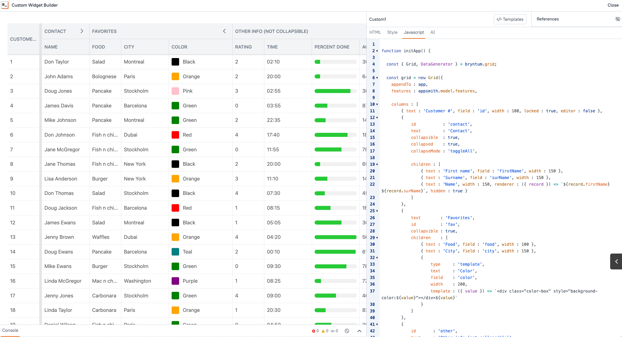
With that you should be seeing the newly created Bryntum Grid! Congratulations!!
Make it Dynamic
Our Custom Widget using Bryntum's Grid is working great! However, a real app will probably use custom data coming from datasources, and you might want to have the ability to define the desired features. For all of that, we'll use the appsmith model. As you've learned,
appsmith.modelaccesses data passed from the Default Model property, allowing you to retrieve configuration and data from other Appsmith widgets and keeps it updated in real-time.Before binding dynamic data to your component, it is important to connect your datasource. Appsmith is capable of connecting to 45+ native datasources that you can then integrate with your Bryntum's components. Learn how to connect datasources inside Appsmith in our official documentation.
So, I have a JavaScript function that calls the data from a database and formats it in the way that Bryntum expects, so I will pass this as the model for the custom widget, like this:
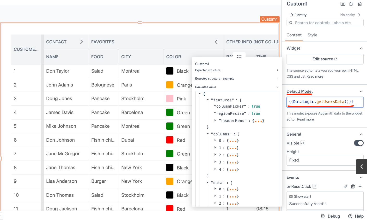
Now, let's go to our Custom Widget editor and update the properties to use the
appsmith.modelfunction initApp() { const { Grid, DataGenerator } = bryntum.grid; const grid = new Grid({ appendTo : app, features : appsmith.model.features, columns : appsmith.model.columns, data : appsmith.model.data }); } appsmith.onReady(() => { initApp(); });With that, now our custom widget will use data from a database and will be kept up to date without any maintenance or updates, with just a few lines of code.
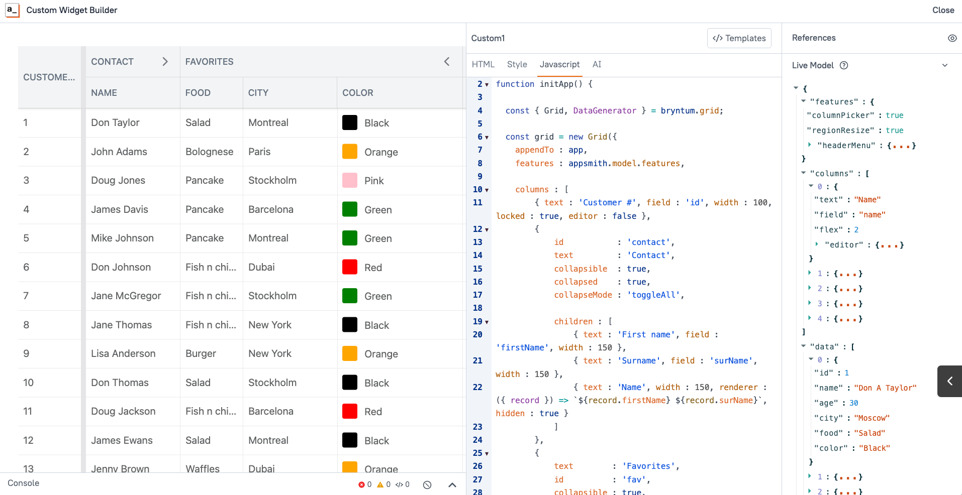
So now you can edit the properties, parameters, and data sets without touching the custom widget code.
Conclusion
Congratulations! You've successfully integrated Bryntum's powerful Grid component into your Appsmith application using the Custom Widget feature. Through this tutorial, you've learned how to:
- Set up and configure Bryntum components within Appsmith's environment
- Leverage Appsmith's Custom Widget methods for seamless integration
- Create dynamic, data-driven grids that automatically sync with your database
- Use the Default Model property to pass configuration and data from other widgets
This basic integration opens up a world of possibilities for enhancing your Appsmith applications. With the foundation you've built here, you can now explore Bryntum's other powerful components like Gantt charts, Schedulers, Calendars, and Kanban boards to create more sophisticated data visualization and project management interfaces.
The beauty of this approach lies in its flexibility—you can easily modify features, columns, and data sources without touching the Custom Widget code, making your applications both powerful and maintainable.
Next Steps:
- Experiment with different Bryntum Grid features and configurations
- Try integrating other Bryntum components using the same approach
- Consider creating reusable UI packages for commonly used Bryntum configurations
Happy building!
