

How to Create Your Own Custom Navigation Bar with Nested Items and Icons
Goal
The goal of this tutorial is to create advanced navigation bars in Appsmith that support showing icons in the navigation bar. We will also explore how nested navigation can be implemented in the same process.
Prerequisites
An active Appsmith account.
A basic understanding of Appsmith's interface and Custom widgets
Overview
Appsmith provides a navbar option for all of your app pages, with both vertical and horizontal alignment options. This is a fast and easy way to implement navigation. But what if you need custom navigation? What if you want icons or styled nav options, or nested options? Luckily, there are some great tools for that.
In this tutorial, we will learn how to:
- Create a custom top navigation bar to navigate between different pages.
- Implement a nested side navigation bar to navigate between tabs inside a specific page.
- Integrate icons into the navigation bars.
Eager to see the finished result? Check out the custom navigation template in the library.
Setting Up Your Appsmith Application
Begin by creating a new Appsmith application or opening an existing one in Edit mode. Determine the pages within your application where you intend to display the navigation bars.
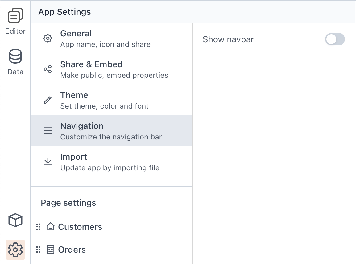
Hiding the Native Navigation Bar
Navigate to the App settings located at the bottom left corner of the page. In the Navigation section, toggle off the "Show Navbar" option to hide the native navigation bar. This step is crucial as we will be creating our own custom navigation bar for the application.
Creating the Main Navigation Bar Widget
Return to the Page Editor and drag a custom widget onto the canvas. Rename this widget as "MainNavBar" for reference throughout the tutorial.
Access the custom widget Settings and click on "Edit Source" to open the widget builder experience.
We can choose to create the widget in either Vanilla JS or any Single Page Application Library such as Vue or React. In this tutorial we will choose to create the widget using React for optimal performance. The Custom Widget builder offers a Debugger Console and two view modes (Splits or Tabs) for a better development experience.
For this widget, as the heavy lifting is mainly in the Javascript and CSS code, our HTML code is minimal
HTML
<div id="root"></div>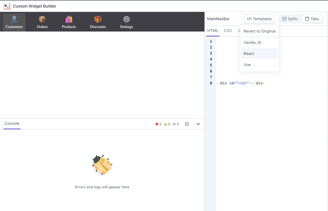
Implementing the Main Navigation Bar Functionality
In the JavaScript section, write the React code for the MainNavBar component.
// Import React and ReactDom ES Modules from URLs
import React from 'https://cdn.jsdelivr.net/npm/react@18.2.0/+esm';
import ReactDOM from 'https://cdn.jsdelivr.net/npm/react-dom@18.2.0/+esm';

function MainNavBar() {
  // Access navigation items from the Appsmith model
  const navItems = appsmith.model.navItems;

  // Determine the initially selected page ID
  let initialPageId = navItems.find(item => item.title === appsmith.model.page)?.id;

  // State to track the selected navigation item
  const [selectedItem, setSelectedItem] = React.useState(initialPageId);

  // Function to handle navigation item clicks
  const handleItemClick = (itemId) => {
    setSelectedItem(itemId);
    let title = navItems.find((item) => item.id === itemId)?.title;
    appsmith.triggerEvent('navigateTo', { pageName: title });
  };

  // Render the navigation items
  return (
    <div className="navbar">
      {navItems.map(item => (
        <a key={item.id}
          className={selectedItem === item.id ? 'nav-item selected' : 'nav-item'}
          onClick={() => handleItemClick(item.id)}
        >
          <div className="nav-icon">{item.icon}</div>
          <span className="nav-title">{item.title}</span>
        </a>
      ))}
    </div>
  );
}

// Render the MainNavBar component when the page is ready
appsmith.onReady(() => {
  ReactDOM.render(<MainNavBar />, document.getElementById("root"));
});
The code handles navigation item clicks and triggers the
navigateToevent configured at the Custom Widget Settings level to communicate with Appsmith App. We will get into more details around Custom Widget's event in later Steps.Finally, we utilize the
appsmith.onReadyfunction to ensure that our custom widget renders only after the parent Appsmith application has finished rendering. Within this function, we employReactDOM.renderto render our MainNavBar component onto the designated HTML element, enabling seamless integration with the application's navigation system.Styling the Navigation Bar
Add the following CSS to enhance the appearance of the navigation bar:
/* Navbar.css */

.navbar {
  display: flex;
  background-color: #3f3f46;
	height: 100%;
	padding-top: 5px;
}

.nav-item {
	cursor: pointer;
  display: flex;
  flex-direction: column;
  align-items: center;
  margin-right: 20px;
	margin-left: 10px;
  color: #fff;
  text-decoration: none;
	padding: 10px;
}

.nav-item.selected {
  background-color: #555;
  border-radius: 5px;
}

.nav-icon {
  font-size: 25px;
  margin-bottom: 5px;
}

.nav-title {
  font-size: 14px;
}
Configuring the Widget's Model and Events
With the HTML, JS, and CSS setup completed, our custom widget, namely the MainNavBar widget, is now ready. Close the editor and return to the Edit mode of the Appsmith Page, and back to the Custom Widget Settings.
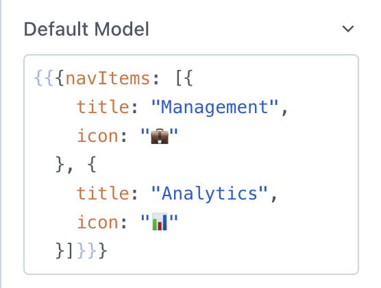
In the widget settings, utilize the "Default Model" field to send the current page and navItems, which populate inside the Navigation Bar.
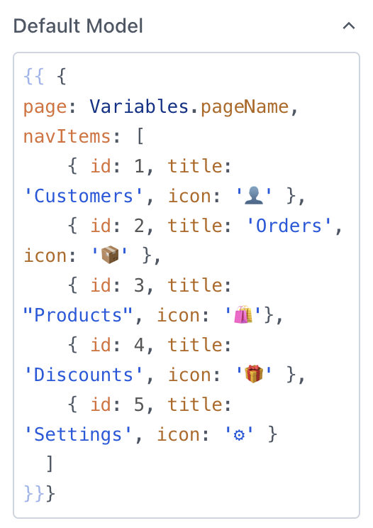
Here Variables is a JSObject which we have created and have a key called pageName that is set to extract the Page Name from the Appsmith URL.
JSObject: Variablesexport default { pageName: _.capitalize( appsmith.URL.pathname.replace("/edit").split("/")[3].split("-")[0]) }
Additionally, we add an event to the widget called "navigateTo", which triggers Appsmith's native "navigateTo" function with the passed argument, the pageName.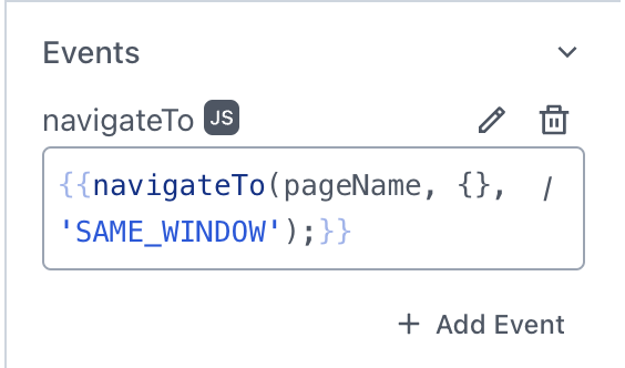
Deploying the Main Navigation Bar Widget
We're now prepared to deploy this widget across all other pages. Simply copy and paste this widget onto all your other pages. Alternatively, you can click on the three-dot menu for the page and export your custom widget as JSON. This can be imported into any app.
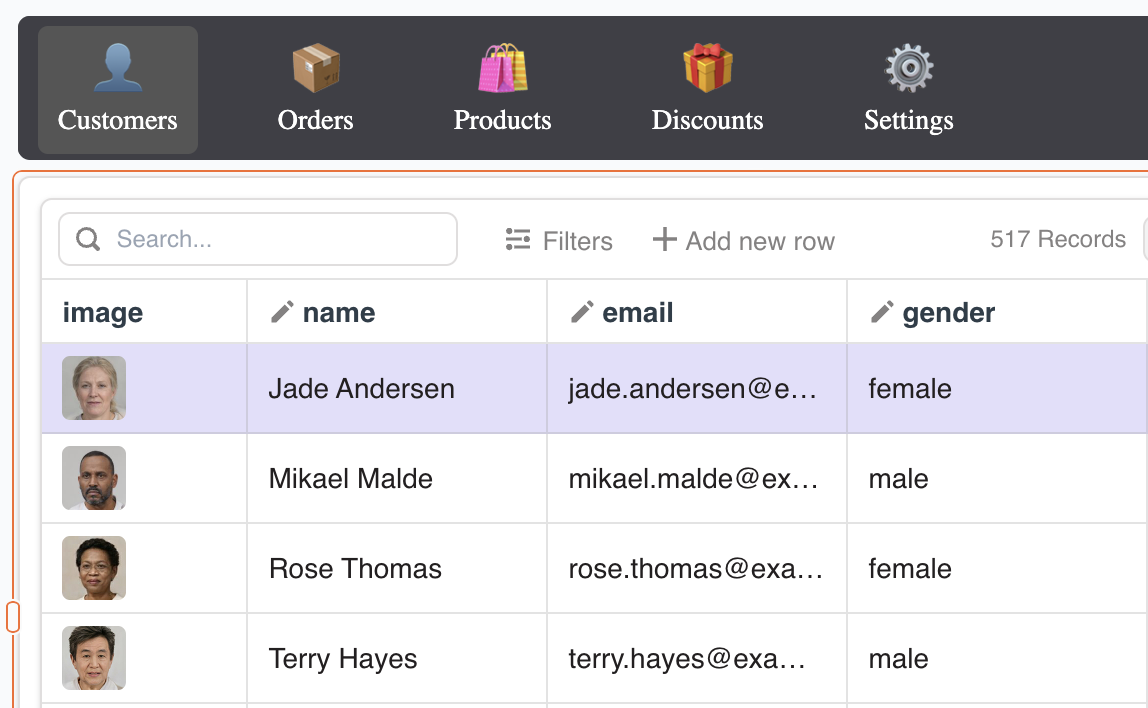
Ensure that your Appsmith Pages' names match exactly with the navItems' titles defined in the Default Model of the MainNavBar custom widget.
It's advisable to complete the custom widget creation on one page before replicating it across others. This ensures consistency and simplifies the process of making additional changes or fixing issues.
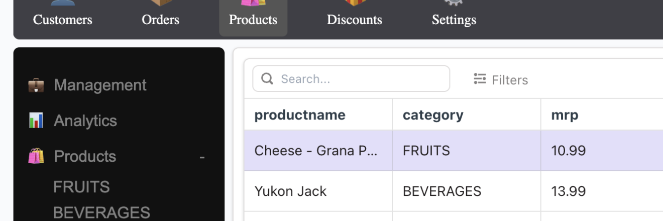
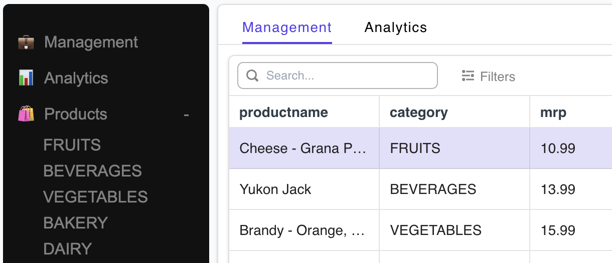
We have successfully created a custom Top Navigation bar for your App, and it will look something like this below.
Implementing the Side Navigation Bar
In this section, we'll introduce a Tab widget and implement a SideBar Custom Widget with nested items. This SideBar widget facilitates navigation between tabs within the Tab widget structure.
The HTML structure remains consistent with our previous setup.
<div id="root"></div>The JavaScript code defines the SideBar component, managing accordion functionality for items with and without sub-items.
// Importing necessary React modules
import React, { useEffect, useState } from 'https://cdn.jsdelivr.net/npm/react@18.2.0/+esm';
import reactDom from 'https://cdn.jsdelivr.net/npm/react-dom@18.2.0/+esm';

// Defining the SideBar component as a functional component
function SideBar() {
  // State to manage active accordion items
  const [activeAccordions, setActiveAccordions] = useState({});

  // Function to toggle accordion
  const toggleAccordion = (index) => {
    setActiveAccordions((prevState) => ({
      ...prevState,
      [index]: !prevState[index],
    }));
  };

  // Accessing navigation items from Appsmith model
  let navItems = appsmith.model.navItems;

  // Determining the initially selected tab ID based on the current page
  let initialTabId = navItems.find(item => item.title === appsmith.model.page)?.title;
  const [selectedItem, setSelectedItem] = useState(initialTabId);

  return (
    // Rendering the SideBar component
    <div className="sidenav">
      {navItems.map((item) => {
        if (!item.subItems) {
          return (
            // Rendering navigation items without sub-items
            <a onClick={() => appsmith.triggerEvent("navigateToTab", { tabName: item.title })}>
              <span className="icon">{item.icon}</span>
              {item.title}
            </a>
          );
        } else {
          return (
            // Rendering navigation items with sub-items
            <>
              <a onClick={() => toggleAccordion(item.title)} className={activeAccordions[item.title] ? 'accordion active' : 'accordion'}>
                <span className="icon">{item.icon}</span>
                {item.title}
              </a>
              <div className="subnav" style={{ display: activeAccordions[item.title] ? 'block' : 'none' }}>
                {/* Rendering sub-items */}
                {item.subItems.map((subItem) => (
                  <a onClick={() => appsmith.triggerEvent("navigateToTab", { tabName: subItem.title })}>
                    <span className="icon">{subItem.icon}</span>
                    {subItem.title}
                  </a>
                ))}
              </div>
            </>
          );
        }
      })}
    </div>
  );
}

// Rendering the SideBar component when the page is ready
appsmith.onReady(() => {
  reactDom.render(<SideBar />, document.getElementById("root"));
});
The CSS styles the Side Navigation Bar for optimal appearance and user experience.
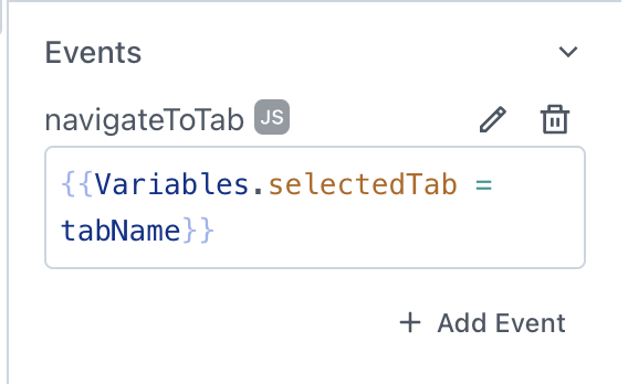
.sidenav {
	height: 100%;
	width: 100%;
	position: fixed;
	z-index: 1;
	top: 0;
	left: 0;
	background-color: #111;
	overflow-x: hidden;
	padding-top: 20px;
}

.sidenav a {
	padding: 10px 15px;
	text-decoration: none;
	font-size: 16px;
	color: #818181;
	display: block;
	cursor: pointer;
}

.sidenav a:hover {
	color: #f1f1f1;
}

.sidenav .subnav {
	display: none;
	padding-left: 15px;
}

.sidenav .icon {
	margin-right: 10px;
}

.subnav a {
	padding-top: 5px;
	padding-bottom: 5px;
}

.subnav a:hover {
	color: #ddd;
}

.accordion::before {
	content: '+ ';
	float: right;
	padding-right: 5px;
}

.accordion.active::before {
	content: '- ';
}
To enable tab switching within the Tab widget, we use the same JavaScript object Variables and introduce another key called "selectedTab", initially set as an empty string.
The "navigateToTab" event in our custom widget changes the value of the "selectedTab" variable based on our selection from the SideBar.
The Default Model of this custom Widget mirrors the logic of the Main Nav Bar implemented earlier, ensuring consistency between navItems' titles and your tabs.
Deploying the SideBar Widget
With the SideBar widget configured to enhance tab navigation within the application, proceed to deploy it across all relevant pages. Simply copy the SideBar widget code and paste it onto each page where tab navigation is required.
By replicating the SideBar widget across multiple pages, users can consistently navigate between tabs within the application, streamlining their interaction and improving usability.
Now that the SideBar Navigation is integrated, consider enhancing the user interface by toggling off the "Show Tabs" option in the Tab widget's settings.
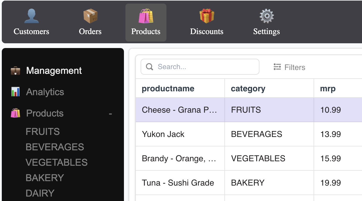
As we conclude, your App's final appearance should closely match the visual depiction below, demonstrating the integration of navigation bars that enhance user experience by facilitating smoother navigation between tabs and pages.
You can also check out the above App and fork it to start working on your own Custom Navigation enhanced Apps. Here is the link below
https://community.appsmith.com/template/custom-navigation-app
Conclusion
Through this tutorial, we've learned how to create advanced navigation bars in Appsmith applications, achieving nested navigation capabilities and the inclusion of icons within the navigation bars.
By leveraging custom widgets and JavaScript functionalities, users can enhance navigation experiences for their applications. Whether it's implementing the navigation bars for seamless page transitions or for tab navigation within pages, these features contribute to improved usability and user satisfaction.
With the skills gained from this tutorial, users can confidently build dynamic and user-friendly navigation systems tailored to their application requirements.
Happy navigating!


Nice work! The navbar looks great and the emojis make it easy to customize without needing another library or icon set.